Logos
These are some logos I have designed over the years.
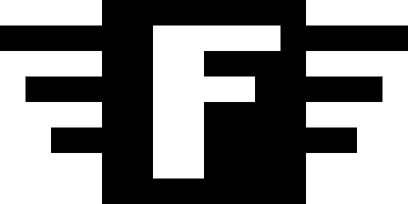
Flying F was an eight bit computer game company. The logo is made all of straight edges because displays at that time were very poor at showing curves. The Atari logo was beautiful, but Atari's products were unable to display it without aliasing horribly. A horizontal run had to contain at least 2 pixels or there would be color aliasing.

The Lockstep Fund is a venture capital firm which invests in entrepreneurial companies that we believe will be the leaders of the Internet. We are taking the lead, setting the direction for the industry. We are doing this by carefully watching the trends, and then following when it seems safe to do so.

Electric Communities was the company I started in 1993 with Chip Morningstar and Randy Farmer to support online communities and marketplaces. This was back when the net was called cyberspace. I have lost the digital original. This image was recovered from a 35mm slide.
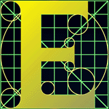
I designed this for the E Programming Language. The USPTO asked my permission to use it in one of their pamphlets. I never saw the pamphlet, but I think it was used as an example of an allowable use of a letter in a trademark.
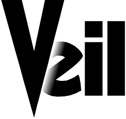
I designed this for a company that was in stealth mode. The idea was that they would later unveil themselves.

I thought this design for JSON, the world's best loved data interchange format, was original, but I was wrong. The credit actually goes to computer artist John Whitney and art director Saul Bass. It was first used in the title sequence of Alfred Hitchcock's Vertigo, which I saw at a drive-in when I was 4.

DEC64 is the floating point standard for all future programming languages.


I made this logo and mascot for the mysterious Faceless Corporation. They put the big in ambiguity.
